The Pet Next Door
Connecting pet owners neighbors through a community app
Project scope
I researched and designed a fictional application to connect pet owners who live in the same neighborhood by identifying what services the potential users could exchange on the platform as a community.
Client
This is was a personal project executed in the context of a case study at General Assembly.
Duration
6-day sprint
Tools
Adobe XD, Miro
Process
Empathize, Define, Ideate, Prototype, Test
My role
User research, sketches, wireframes, interface design, user testing
How might we connect pet owners who live in the same neighborhood?
The idea that sparked this project came from my personal experience of moving into a new neighborhood. My landlord had a piece of paper taped next to the front door: it was a list of all the neighbor’s names as well as their pet’s name. How curious! Why include the pet’s name? “Because people with pets are good people. And sharing a common interest for animals is a great way to connect with people around you when you are new,” she said.
WHO IS MY FUTURE USER?
I started my research with three interviews of my new neighbors. Throughout a series of 20 questions, I aimed to gather from them an understanding on the type of connections they had with their current neighbors. I also wanted to know how they were going about finding services, and exchanging tips and advice about their pets.
Using these conversations, I built an affinity map and discovered three main pain points that I would need to address in the app.
Build the trust with the neighbor: the user would like to find reliable people living nearby. How might we create a trusted environment that facilitates an exchange
Ensure privacy: the user would like to be able to choose to whom they can connect. How might we create friends requests and allow for private communication between them
Need to share and exchange: the user would like to exchange with other pet owners who are caring for similar animals. How might we create meetups and a discussion board to help build the community?
Francisco, the busy pet owner and his french bulldog Oscar
Behavior
Often works late and wishes he could text a close friend to ask him or her to walk his dog
Would love to exchange puppy training ideas with other bulldog owners
Loves when Oscar gets to see his friends at the dog park. Unfortunately they all go at different times, especially on weekends.
Goals and Needs
When needed, find trusted support for his pet from people who live close by (and avoid imposing on friends who live farther away).
Have a reliable source of advice from dog owners, other than the vet
Share dog activities
Frustrations
Doesn’t want to impose on friends who live far away
Cannot stick to a regular schedule for the dog park due work schedule, so misses out on meetups with his dog’s friends
What apps are out there already?
I did some competitive analysis to discover how other applications were solving pet owners’ needs and/or connecting pet-owning neighbors. I discovered that what was currently available in the market was either about the neighborhood, or about paid services for animals. None were bridging both.
Nextdoor
”When neighbors start talking, good things happen”
Pet Connect
”Find pet-friendly resources from your phone”
Rover
”Local, loving pet care”
Go Petie
“Build your pet community”
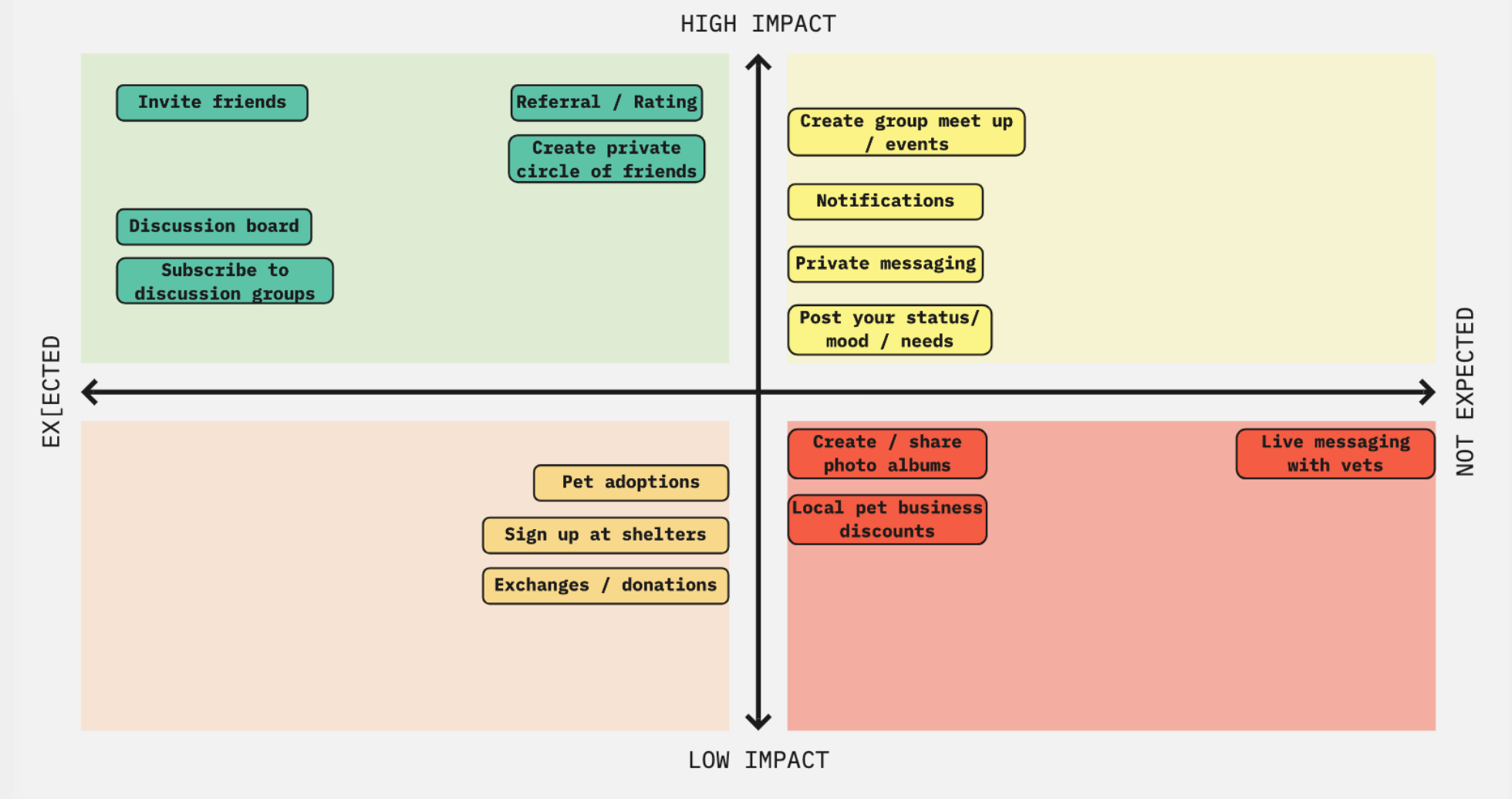
To solve my user’s issue, I needed to implement several features such as a referral program, discussion boards, or the ability to create groups of friends. There were so many options!
How would I go about determining which one to roll out first? I decided to organize them in a feature prioritization matrix in which I would identify which features would be necessary to make version 1 of the app a viable product.
User flow & first sketches
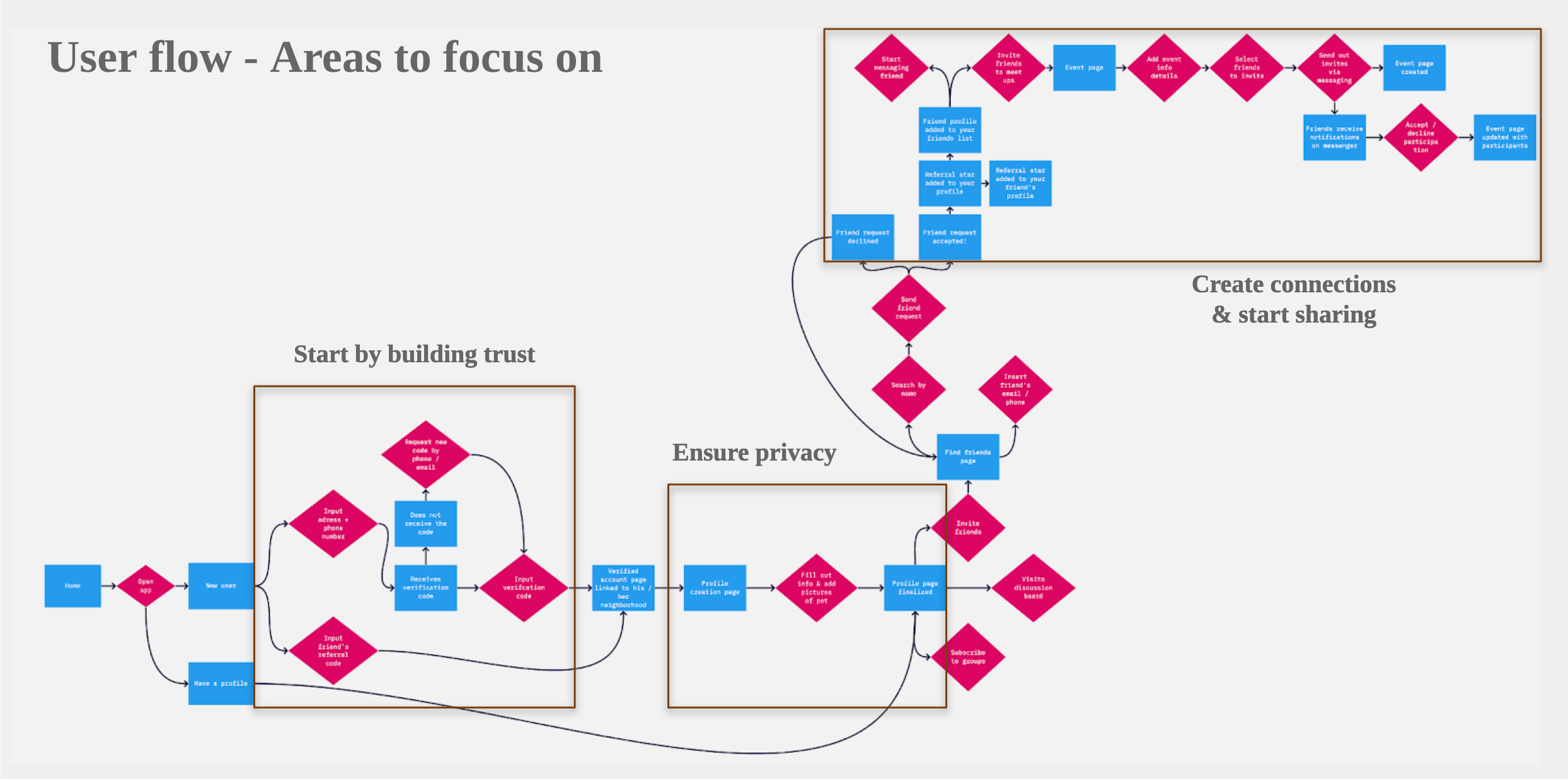
With the MVP in mind, I designed the happy path a new user would go through to get started on The Pet Next Door.
In the user flow, I focused on designing clear steps to solve the main points discovered in the research: the referral program, the privacy setting, and the ability to create meetups/exchange services.
And then, I started sketching the happy path keeping in mind each screen must be simple and clear.
Prototyping & usability testing
To verify that my design was intuitive and coherent, I did four rounds of usability testing. I started with a low-fidelity paper prototype, followed with two tests on grayscale wireframes, and one final round with a high-fidelity prototype.
Each usability testing user was assigned three tasks. They were all able to complete the three tasks assigned, though completion time varied.
Task 1: Create a new account on The Pet Next Door and choose the privacy level of your account
You move into a new neighborhood with your dog. Your neighbor recommended you sign up to The Pet Next Door app. But you like your privacy, so you want to make sure there is a way to do so in the app. How would you go about this
Task 2: Look up which of your neighbors are already on The Pet Next Door and send them an invitation to join your friends’ circle
You would like to connect with the neighbors you know in the building via this new app they mentioned. You have already signed up; you just need to find them. How would you go about this?
Task 3: Send out a meetup invitation to your friends on The Pet Next Door
You would like to go to the dog park this Sunday with the neighbors you know. How would you go about this?
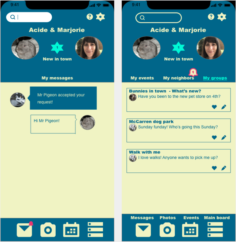
Insight 2: the user did not immediately see the notification bell on the message icon signaling that a neighbor had accepted his friend request.
Solution: the notification button was moved next to the “my neighbors” tab
Insight 3: the user did not understand that the message icon was for the message board option within the app. He thought the message icon was to send emails via his gmail account on his phone.
Solution: text to describe icons was added on top of the icons themselves
Insight 1: the user was concerned about accessibility of the forms. Indeed the text inside the boxes would disappear as the user would start inputting information.
Solution: text was added above each form field, so the user could still read what piece of information to enter in the field while typing it in.
Insight 4: it was unclear to the user that the “+” sign icon was for adding pictures.
Solution: the “+” sign icon was changed to a camera icon to make it clearer
The final prototype & next steps
After implementing the solutions from the usability testing results, I produced the final prototype.
Next steps will include a deeper study on possible UI to build brand identity as well as the design and prototyping of the features that did not make it into the first MVP.
Takeaways
My neighbor was right: animal lovers are kind people!
People are more inclined to trust someone if they pay them for a service rather than a neighbor who actually live in the same building.
It is okay to break down on-boarding into smaller steps and make the user tap/click several times, as long as the user doesn’t consciously notice the taps/clicks.


